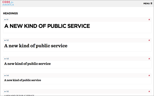
Credit: Code for America
As part of the rollout for its revamped website, Code for America has released something of peek behind the scenes: A pattern library for recreating the civic tech non-profit’s digital identity far and wide, a step toward the long-held goal of becoming a umbrella for local organizing.
When it comes to Code for America, this is about more than making sure the belt matches the shoes. A main thrust of the 5-year-old San Francisco-based organization is to replicate its successes from city to city — something of a necessity, given its total number of fellows hovers somewhere in the very low three figures. Driving the new design language in general, blogs CTO Michal Migurski, is the idea that "that this is an accessible, welcoming place that shares its secret sauce."
Pattern libraries are popular with designers, who often point to the 1977 book A Pattern Language, which lays out solutions to 253 common design challenges. But it’s probably fair to say that designers celebrate pattern libraries more than their clients actually want to see them published.
Though it’s not unheard of. The Obama campaign made some of its visual elements available to supporters, so that they could whip up "Bicyclists for Obama" buttons and the like without having to ask the campaign headquarters in Chicago for help. It was a way of encouraging grassroots participation while maintaining top-down branding to make sure things never got too ugly.
When it comes to the code side of equation, CfA is betting on sharing solutions through its GitHub repository. But releasing design patterns as well helps extend the brand, as it were. It makes it easier for everything associated with the organization to look like it’s part of the same structure. You get the benefit of professional design work, even if you’re just a few folks in some city somewhere participating in one of the group’s Brigades, or volunteer chapters.

A screenshot from Code for America’s new pattern library.
While corporations, for obvious reasons, tend to keep their design libraries quiet, Starbucks is one of the few that has publicized at least a partial guide to its online visual identity. This means that what’s stopping an online version of Dumb Starbucks — the Los Angeles parody where everything looks like a real Starbucks, except the logo and products are pre-pended with the word "dumb" — isn’t HTML.
The CfA site’s visuals and accompanying design guide were produced by Clearleft, a creative firm based in Brighton, England. In Code for America’s case, the archive covers everything from its flag logo to how calendars and maps should look to the fonts and framing of pull quotes. Take a look.