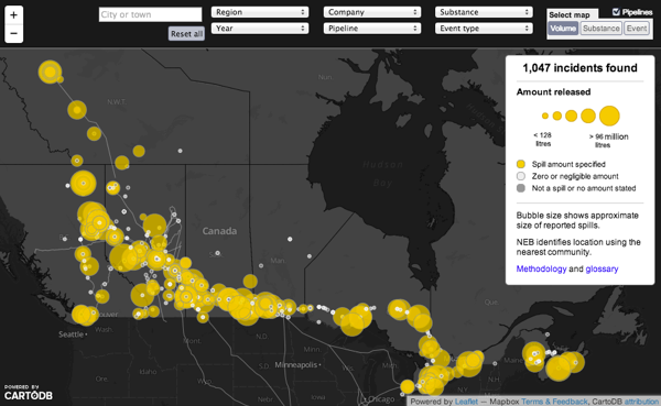
The CBC’s new Pipeline Incident Map. Credit: CBC.ca
In North America these days, there’s broad enough public awareness of pipeline safety that it’s common to hear mention of "Keystone XL" in any far-ranging political conversation. But one overlooked wrinkle is that what we actually know about pipeline operation is hit and miss.
For one, some argue that Canada has lagged behind the U.S. in making available the details of pipeline accidents — or even of where pipelines run. What’s easily known about the operation of Canadian pipelines is largely limited to news reports, with much more locked away in corporate maps and government databases. "If anyone wants any information on any Canadian pipeline that we regulate," Patrick Smythe, head of the National Energy Board, told the Canadian Broadcasting Company last month, "they can come and ask us for that information."
Truth be told, pipeline transparency in the United States isn’t stellar. The National Pipeline Mapping System, which went offline for a couple of years in the wake of 9/11, is spotty. Still, it can reward the diligent researcher or concerned citizen. Individual states publish pipeline data online, which are in turn checked by outsiders. For instance, the Pipeline Safety Trust — a group started after the 1999 pipeline rupture in Bellingham, Wash. that killed three local boys — rates state pipeline websites each year. The conversation on the U.S. side of the border is about the meaning, then, of the data made available. When is a leak serious enough to worry about? Are increased incident rates simply the result of more diligent accident reporting?
But as Carl Weimer, the Trust’s executive director, told the CBC, "that can’t happen in Canada at this point because there isn’t any data to argue about."
So the CBC set out to change that. Last August, the news organization filed an access-to-information request with the National Energy Board for incident reports on 71,000 kilometers of pipeline that cross Canadian provincial borders, running from 2000 through late 2012. What came back was a CD with details on 1,047 separate accidents, leaks and explosions.
But it couldn’t have been less user-friendly, the CBC’s reporters write in a great dissection of their journey into data journalism. What had been an Excel spreadsheet had been split in two and turned into PDFs, so that single records were split across multiple documents. (One document would list the name of the company involved, for example, but the details of the actual incident lived in the second document.) Some of the material had been run through the redacting software AccessPro, resulting in "a grainy image of the original spreadsheet."
To turn those PDFs into workable data, the CBC team used optical character recognition — or OCR — software to convert it to text, and then set about filling in the significant holes in the data using information provided elsewhere in the database. But, the reporters write, "as much as the CBC tried to clean up the database, what became apparent was the amount of information that appeared to widely fluctuate between employees." To cover those gaps, the CBC dug up new reports on incidents where they were available.
The result of all that work is the CBC’s interactive Pipeline Incident Map, released last week.
Click on an incident, and up pop details. "At 22:00 a third party contractor cleaning a tank," reads one from May 6, 2009, in Burnaby, British Columbia, "reported to the Kinder Morgan (Terasen) Burnaby Control Room, a failure of a one inch fitting on the suction pump."
To help complete the transparency loop, the CBC shared a sample of the cleaned-up data with the National Energy Board, which offered some corrections on the methodology. It then posted both the original files and the final CSV file, so that others might use the data to analyze pipeline incidents.
More than that, though, the CBC has asked the public to help make sense of the incidents contained in the database, particularly those close to home. Each record comes with a “Can You Help?” button for feedback, a feature inspired by the Guardian‘s MPs Expenses project that asked citizens to vet the spending records of politicians. (That effort uncovered a number of stories, from the unsettling — tens of thousands of pounds spent on second homes — to the weird, like a member of Parliament who claimed £43.56 spent on the shopping channel QVC, including for three — three! — garlic peeling sets.)
Here, though, the goal is a bit different. Rather than drilling into the data to find outliers, the CBC is aggregating the data to give an overall picture of a network of physical, real-world pipelines that has proven nearly impossible to see any other way.